Most office buildings in America follow an established formula. A glass tower with a 42’ lease-span from the core, a 5’ facade grid, 30’ column spacing, and 14’ floor-to-floor height. A formula that worked well, until millennials started to proactively shape their work environments to better suit their work-life requirements.
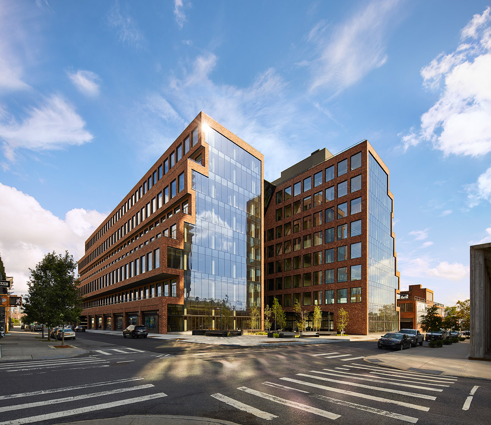
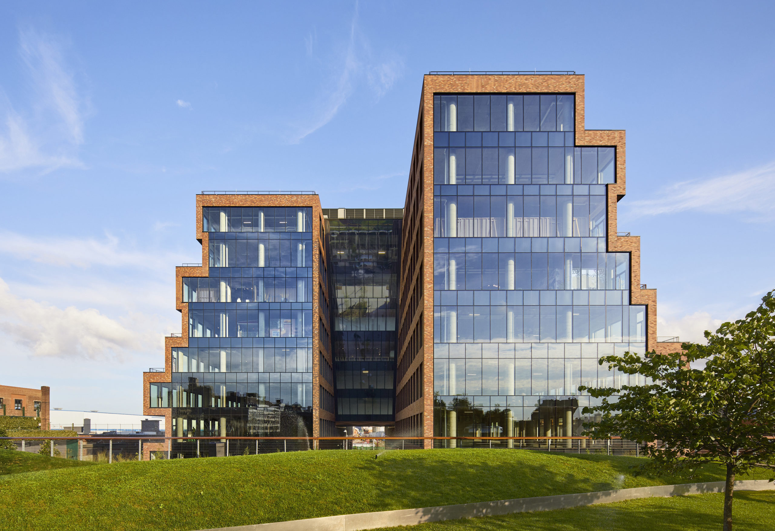
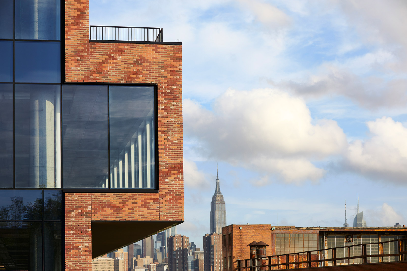
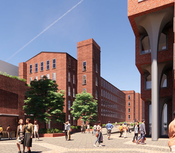
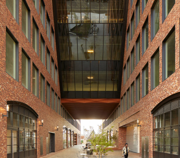
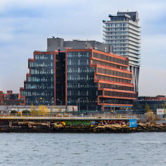
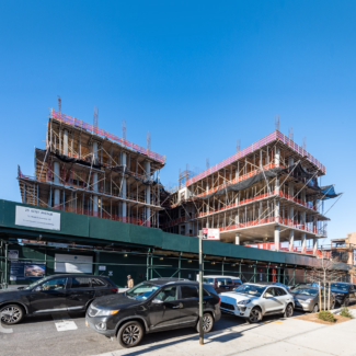
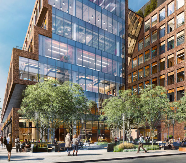
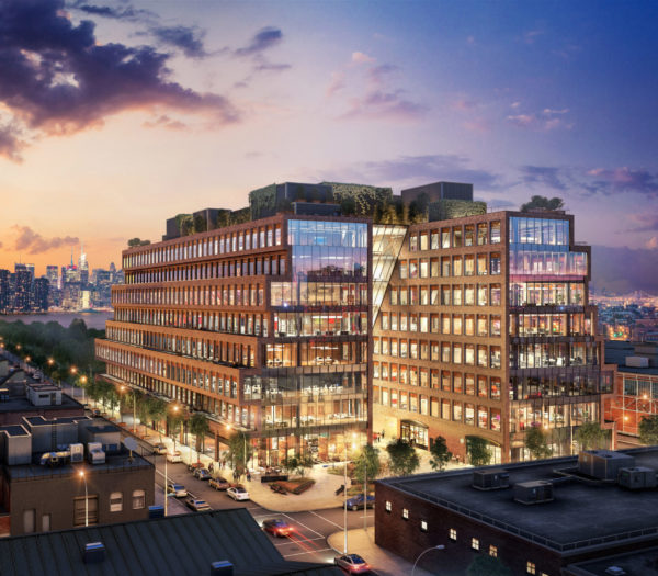
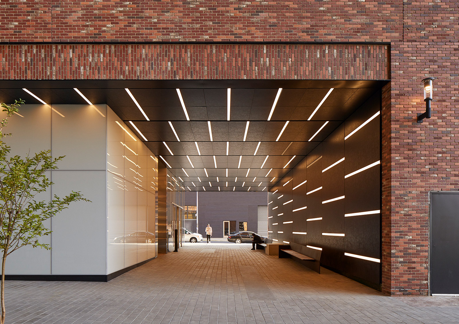
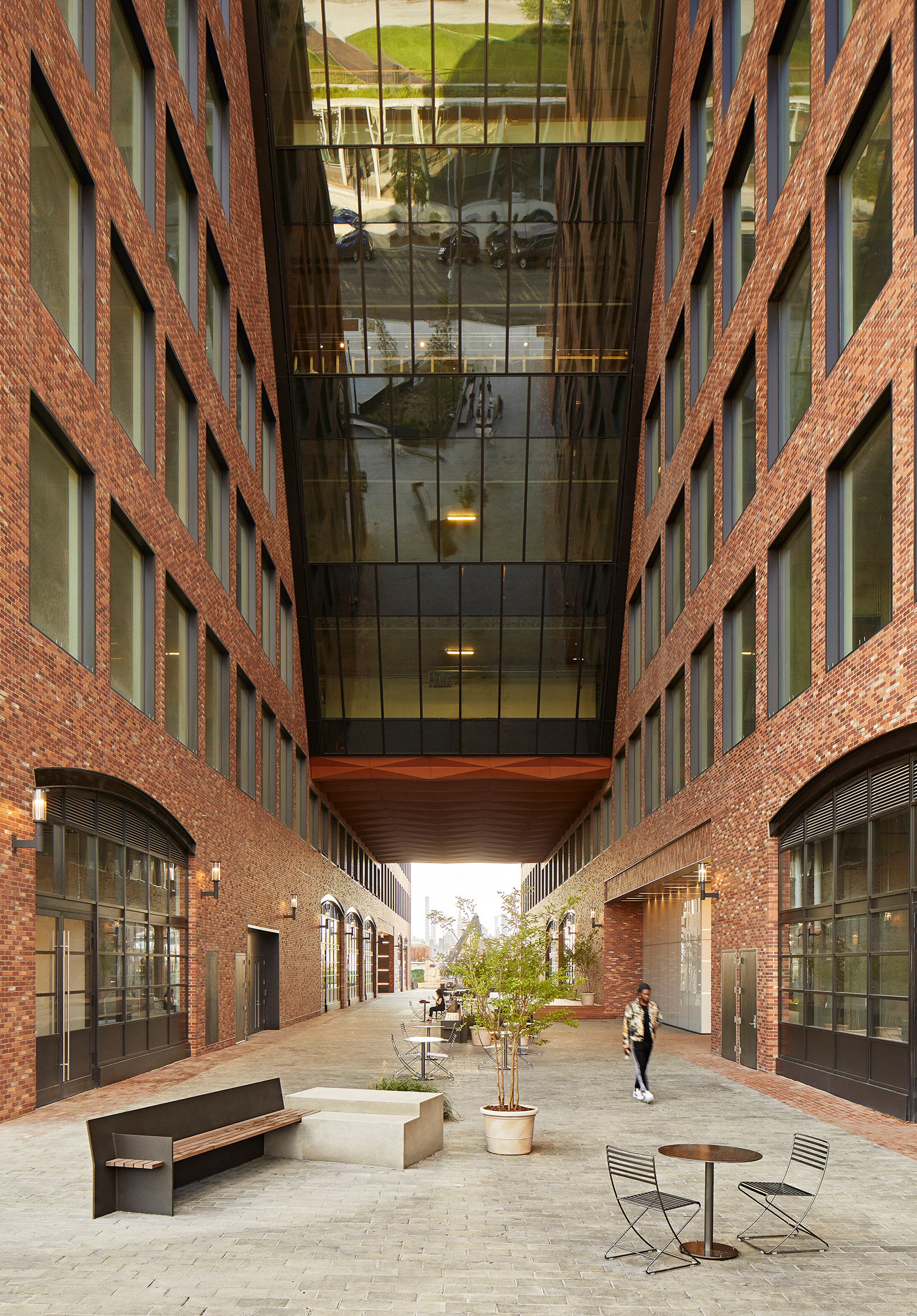
Our design for 25 Kent takes everybody into account. We designed from the outside in by choosing local forces, shifts within society, and the power of creativity as guiding principles. What emerged is a 500,000-sf office building that engages with the context and its inhabitants. Upon arrival, the visitor encounters the stacked warehouses that take reference from the surrounding buildings, while the sculpted public passage penetrates the building and draws one in.
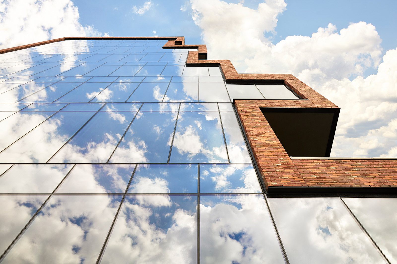
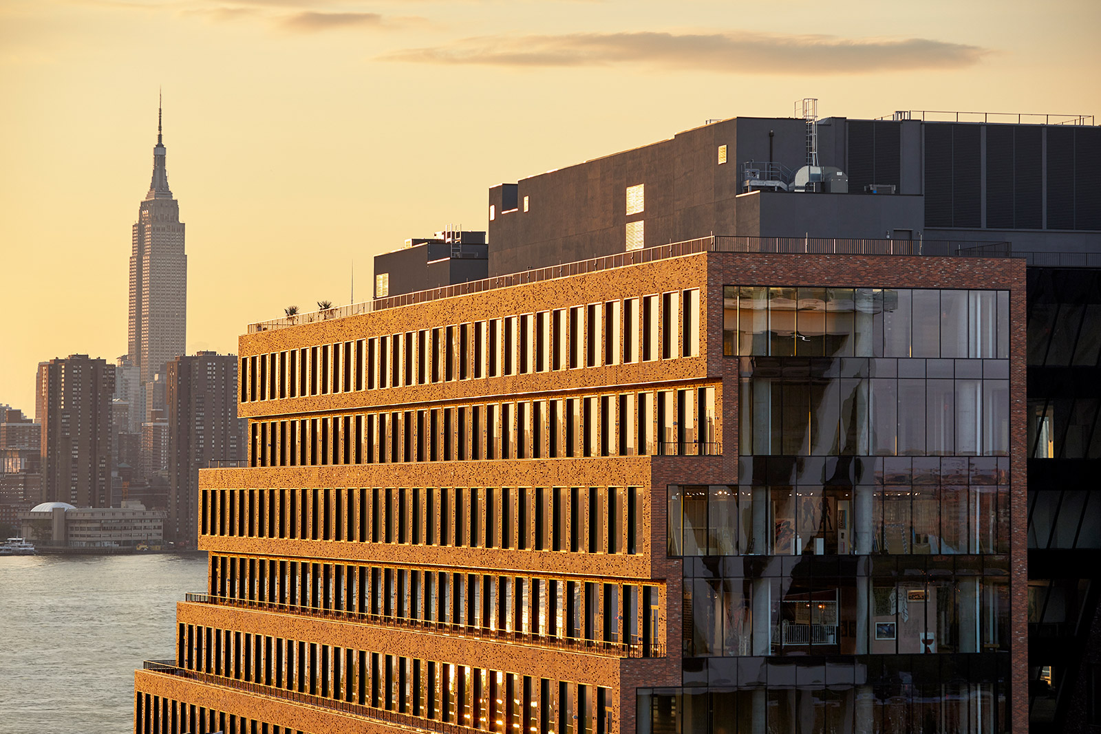
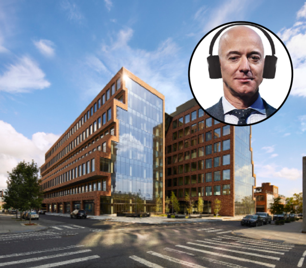
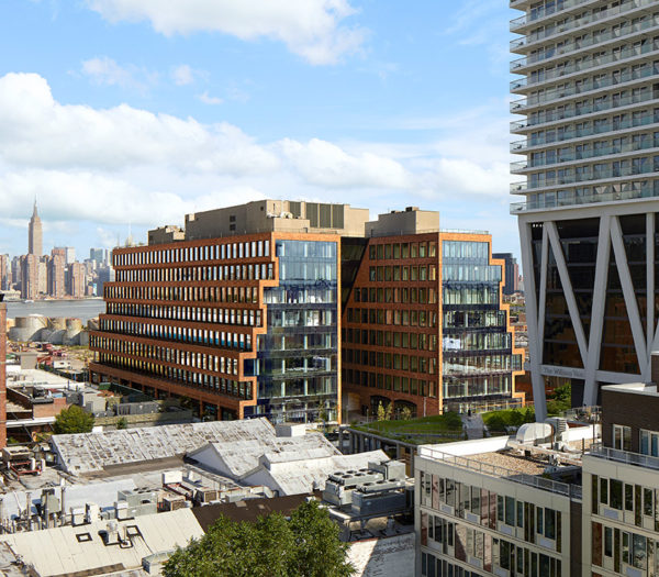
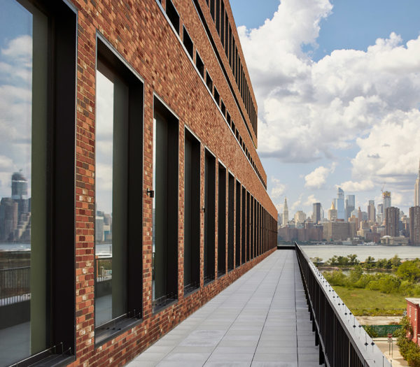
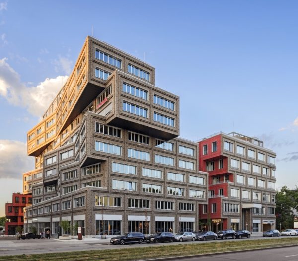
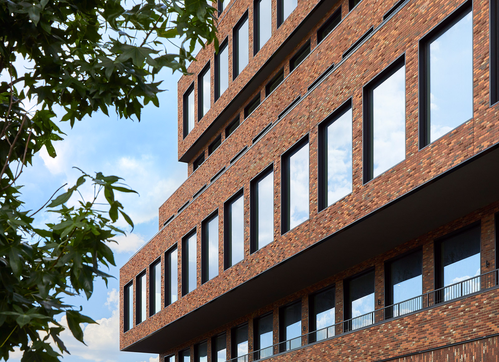
The step-back design of the north and south sides of the building creates balconies and also scales down the presence of 25 Kent on the smaller side streets. The unique staggered shape of the 8-story mass, the recognizable section splices on both ends of the building revealing the interiors, and the dramatic valley shapes a new work environment. The sculptural impact of the exterior ripples through the entire building reinventing the office interiors. The central core is split into two, and turned into flanking access banks.
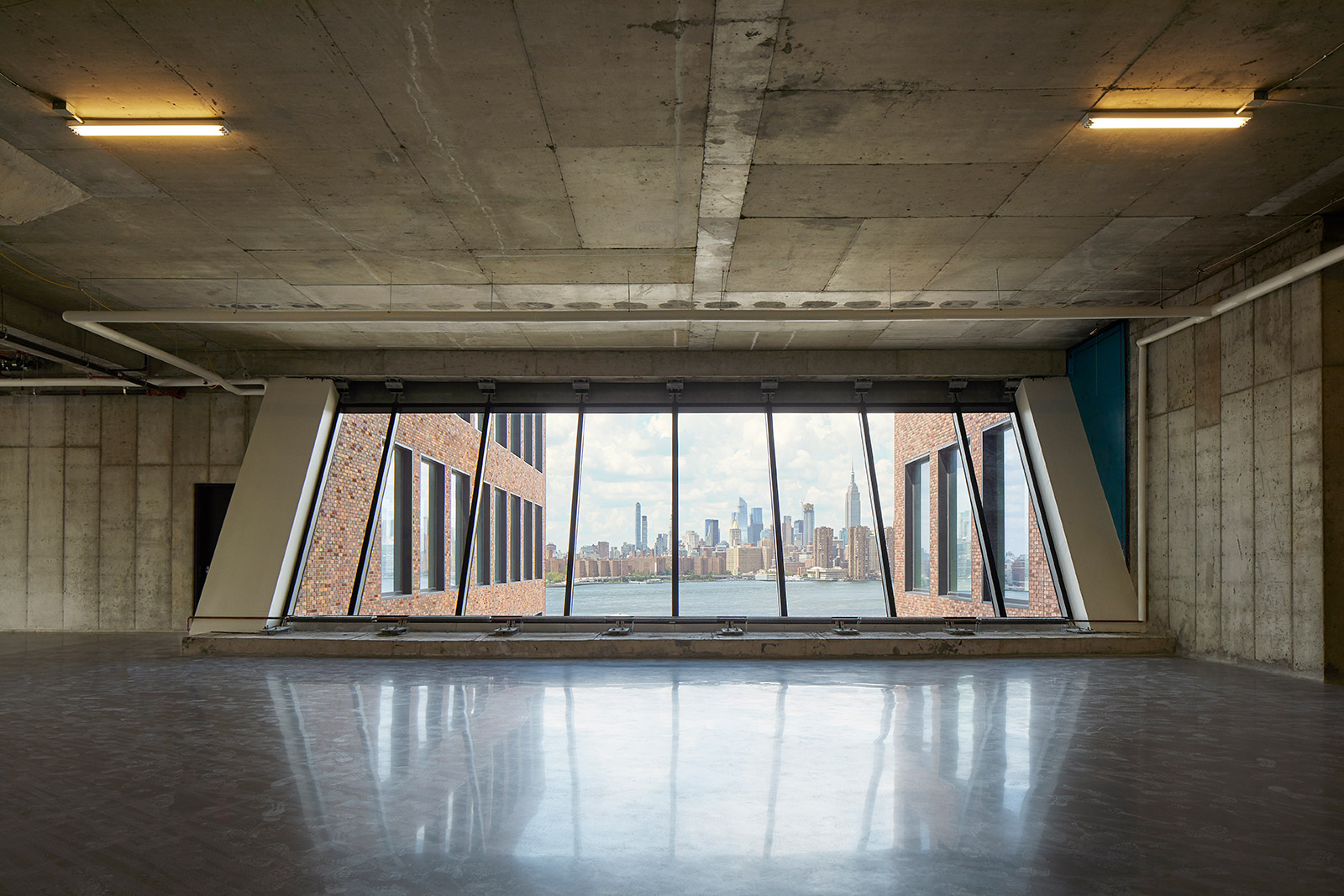
A variation of exceptional office spaces arises, including three sides of window corner office spaces that are 65’ wide, 140’ deep midsections, balconies, and everything in between. Here, creativity meets local manufacturing, robotics, and social entrepreneurship. Here a new bond between a development and the historic neighborhood has been established, with a building that catapults a neighborhood into the next century while strengthening its existing values.
At 25 Kent, art, architecture, and development create a new symbiosis. For us, 25 Kent is the continuation of our quest to create exceptional buildings with a purpose, that balance the rational and irrational, and add value to people’s lives.
